ANZ — Design System
Helping build and roll out the design system for ANZ’s web and mobile banking.
Highlights
- Design system for goMoney and Internet Banking
- Sketch to Figma migration and rebuild
- Contribution model and team adoption
- Closer design-to-production alignment
Role
Senior Product Designer
Tools
Sketch, Figma, Storybook
Skills
Design Systems, Component Libraries, UI Design, Android, iOS
Length
3+ Years
The first goMoney library in Figma.
A big part of my role was helping build the foundations for ANZ’s web and mobile libraries. We
moved what we could over from Sketch to Figma, but a lot of it had to be rebuilt from scratch.
I set up and maintained the libraries, refined and published components, and worked closely with
designers and developers to keep things aligned across goMoney and Internet Banking. I also
worked with feature teams so new work could feed back into the system instead of drifting into
one-off solutions.
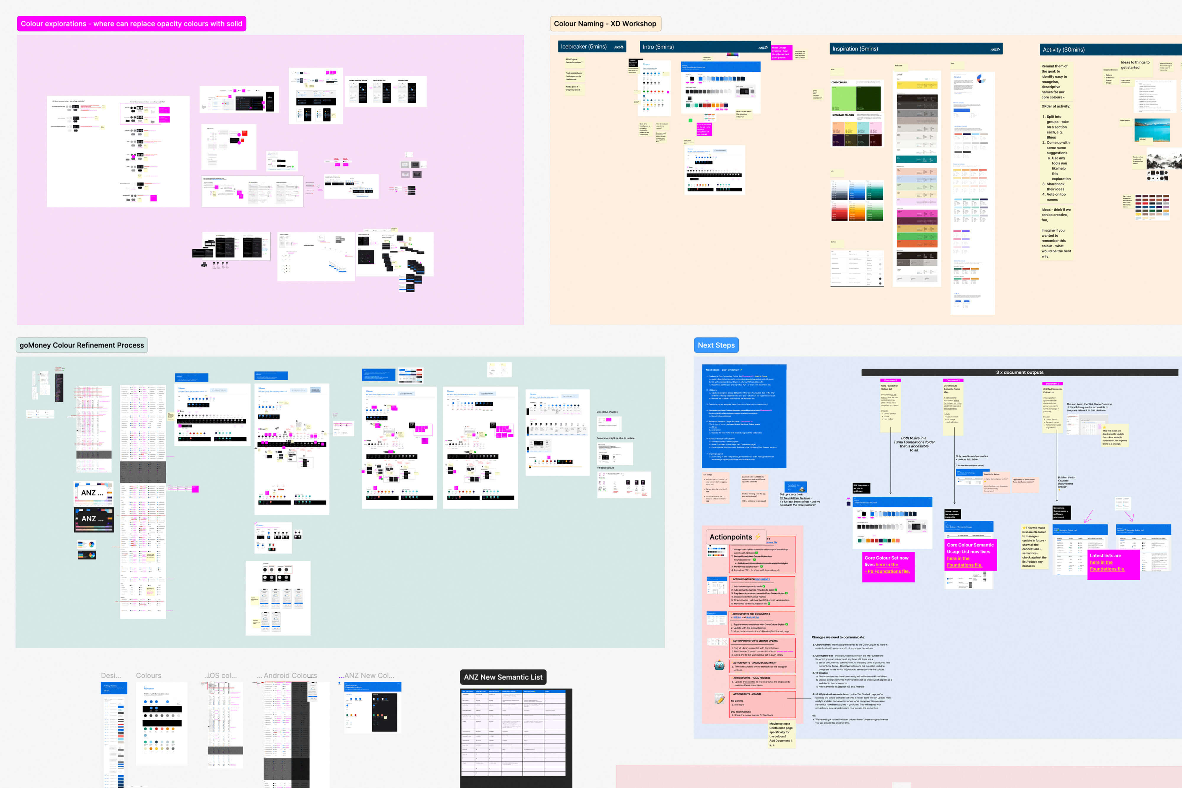
Early audit, check-ins and rollout work with the wider teams.
As Figma changed, the libraries changed with it. I rebuilt parts where it made sense and brought
in things like auto layout, component properties, variables and branching as those features
became more useful. A lot of the work was practical: making the components solid, improving
patterns, and keeping a tight link between design and production.
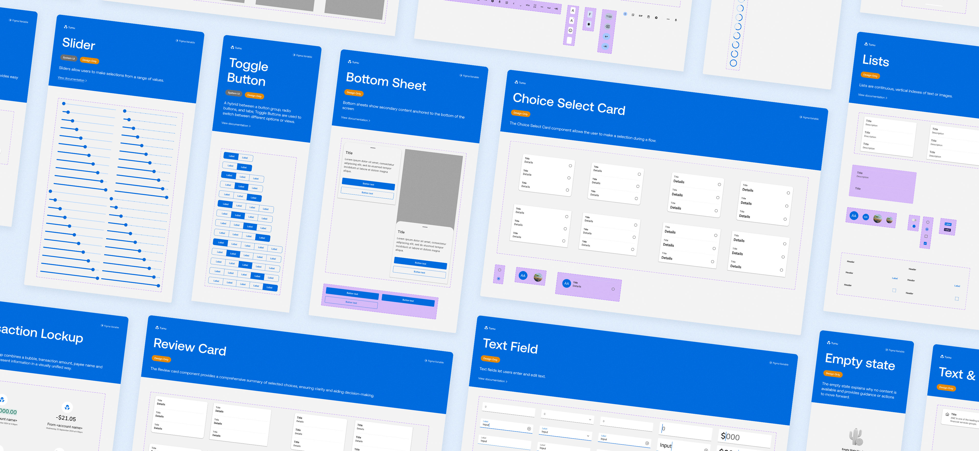
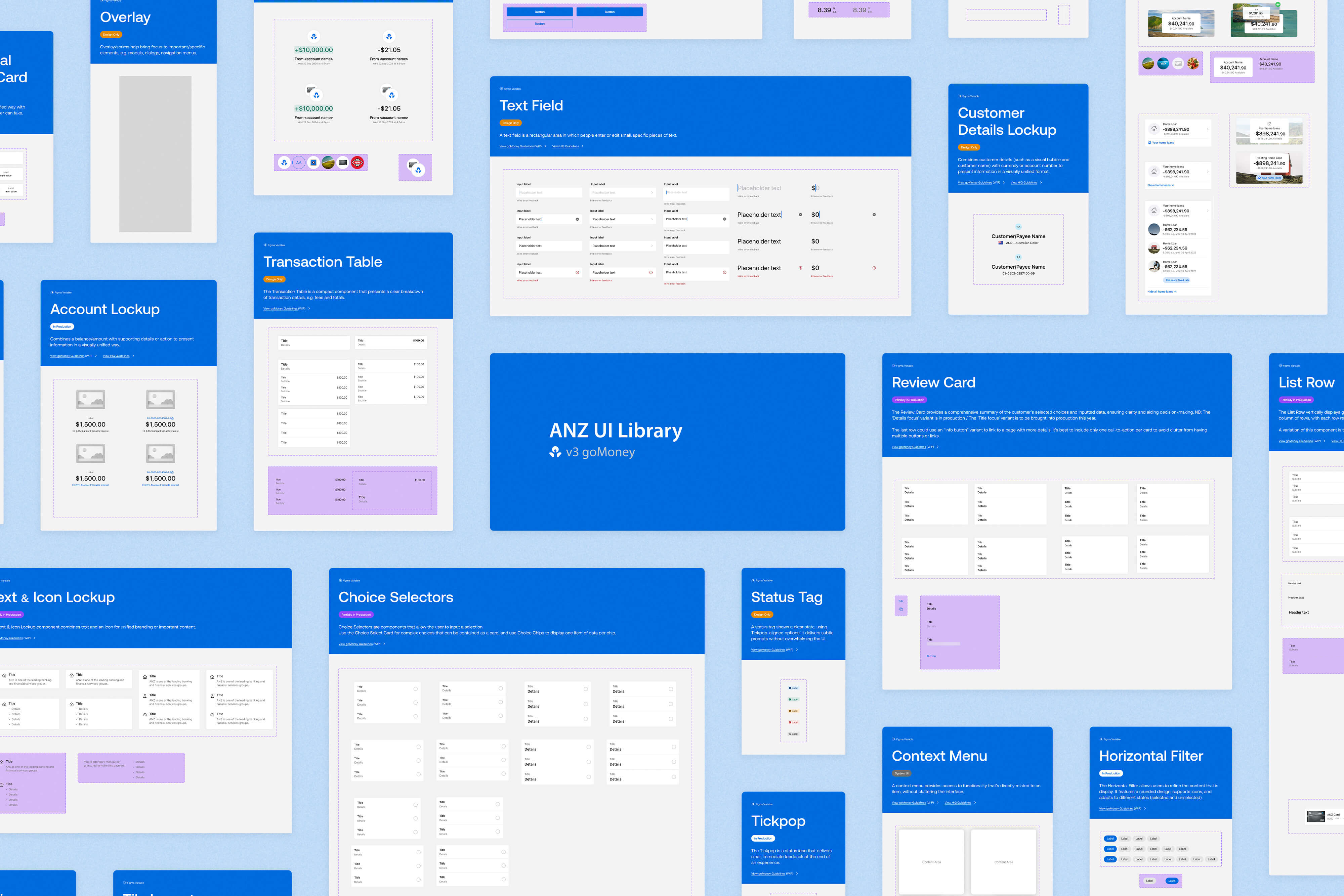
Version 2 of the goMoney library, split into foundation and platform-specific files.
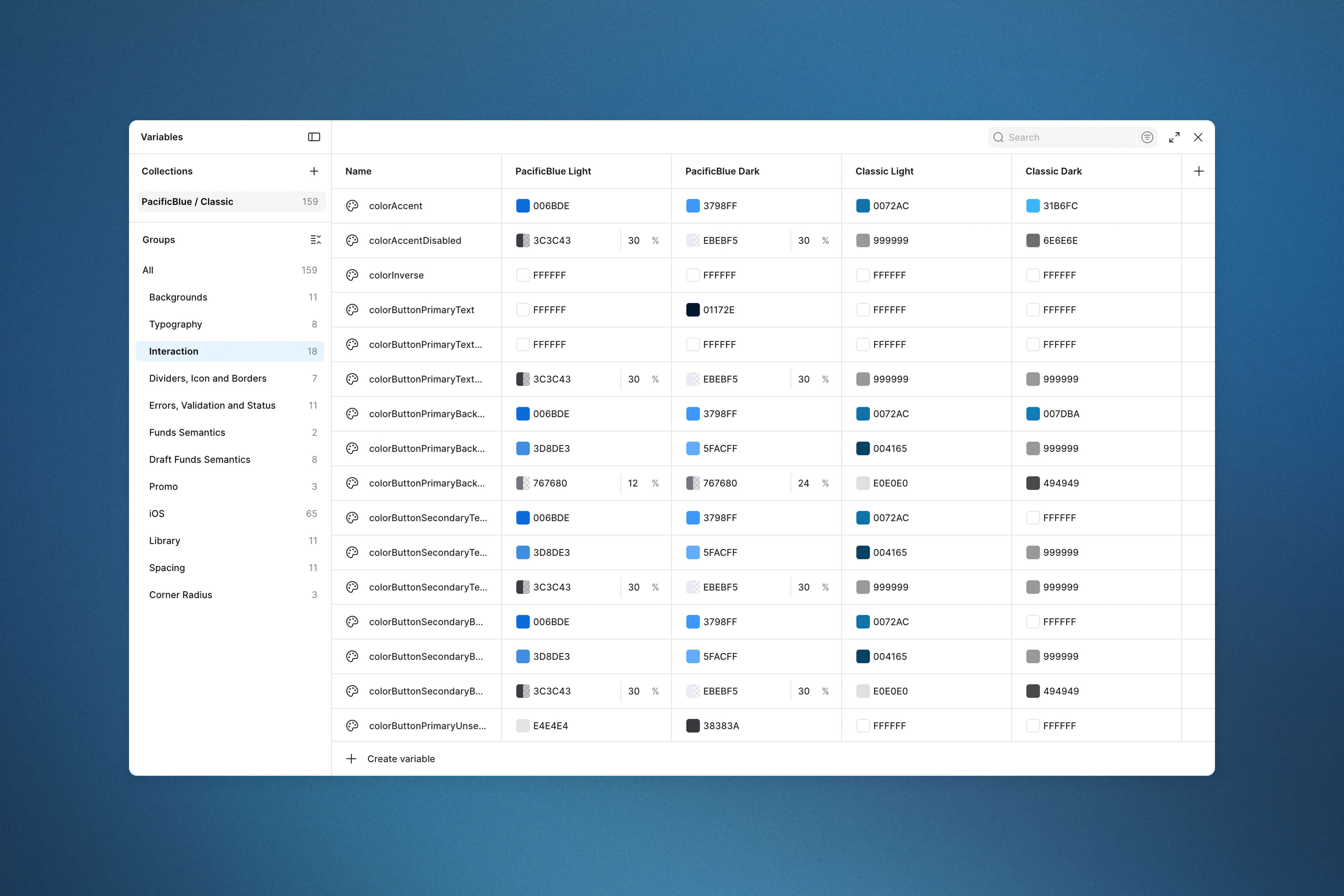

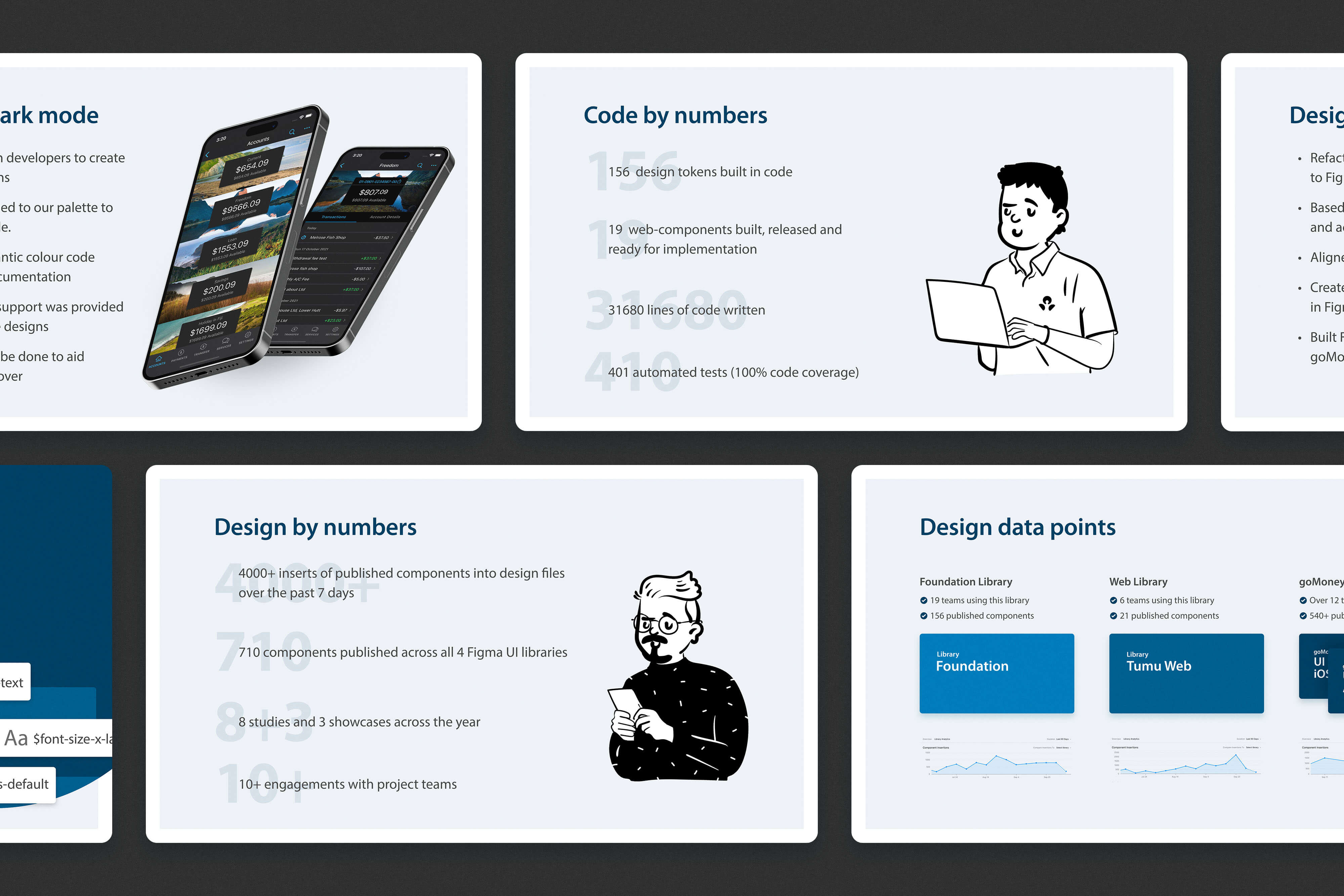
Variables, patterns, and other library work as the system grew.
Adoption wasn’t something we could force. If the library slowed people down, they just wouldn’t
use it. So part of the work was getting teams involved, building a contribution model, working
through component and pattern deprecation, and understanding what designers actually needed day
to day. The aim was to make the system useful enough that it became part of the workflow, not
just another library file sitting off to the side.
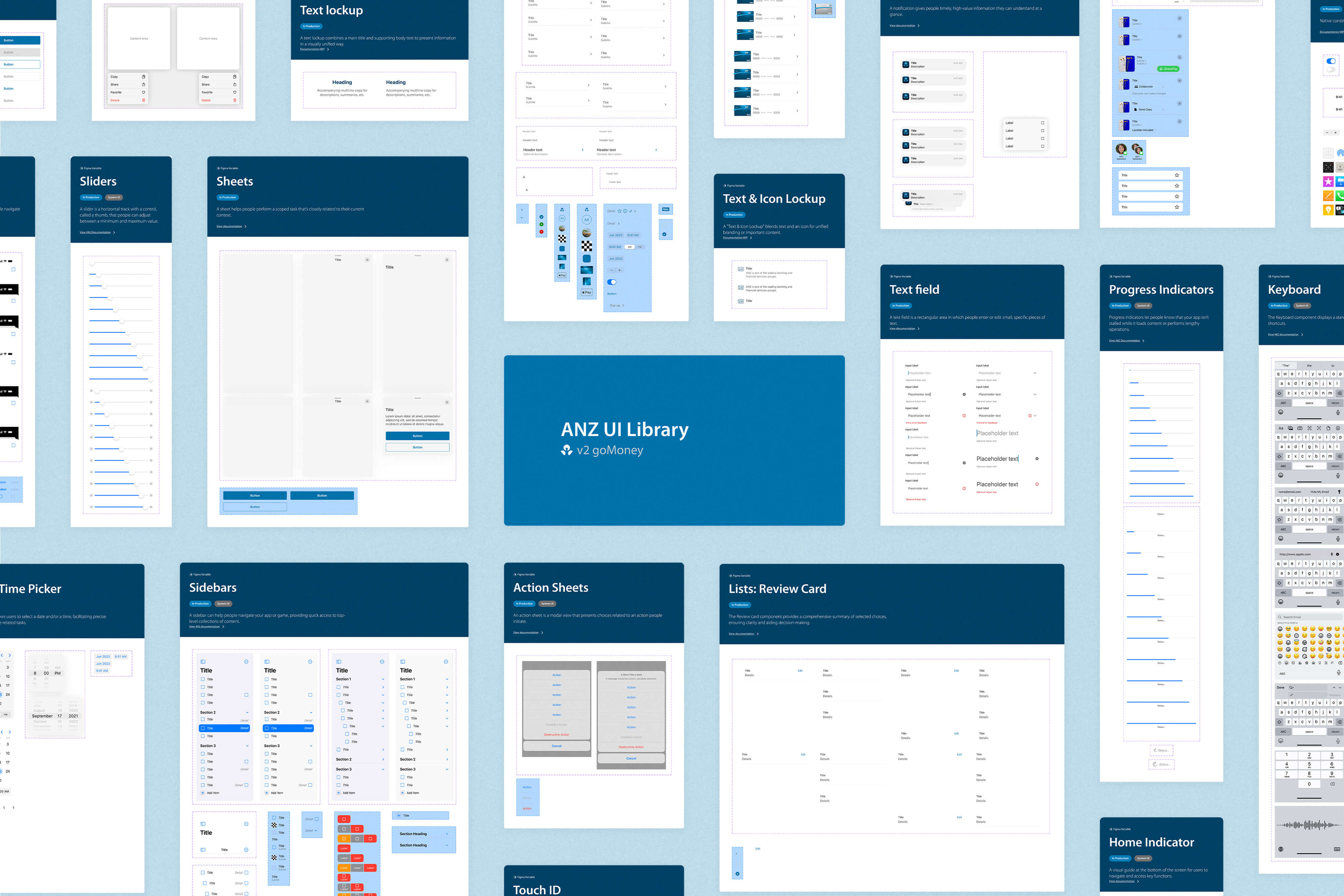
A later version of the goMoney library, after a brand uplift and closer alignment with native OS styles.
In the end, we built a design system that gave designers a clearer starting point and made
day-to-day work easier. There was less time spent rebuilding common screens and components,
better consistency across products, and a tighter link between design and production.