ANZ — Feature Design
Helping design new banking features across goMoney and Internet Banking.
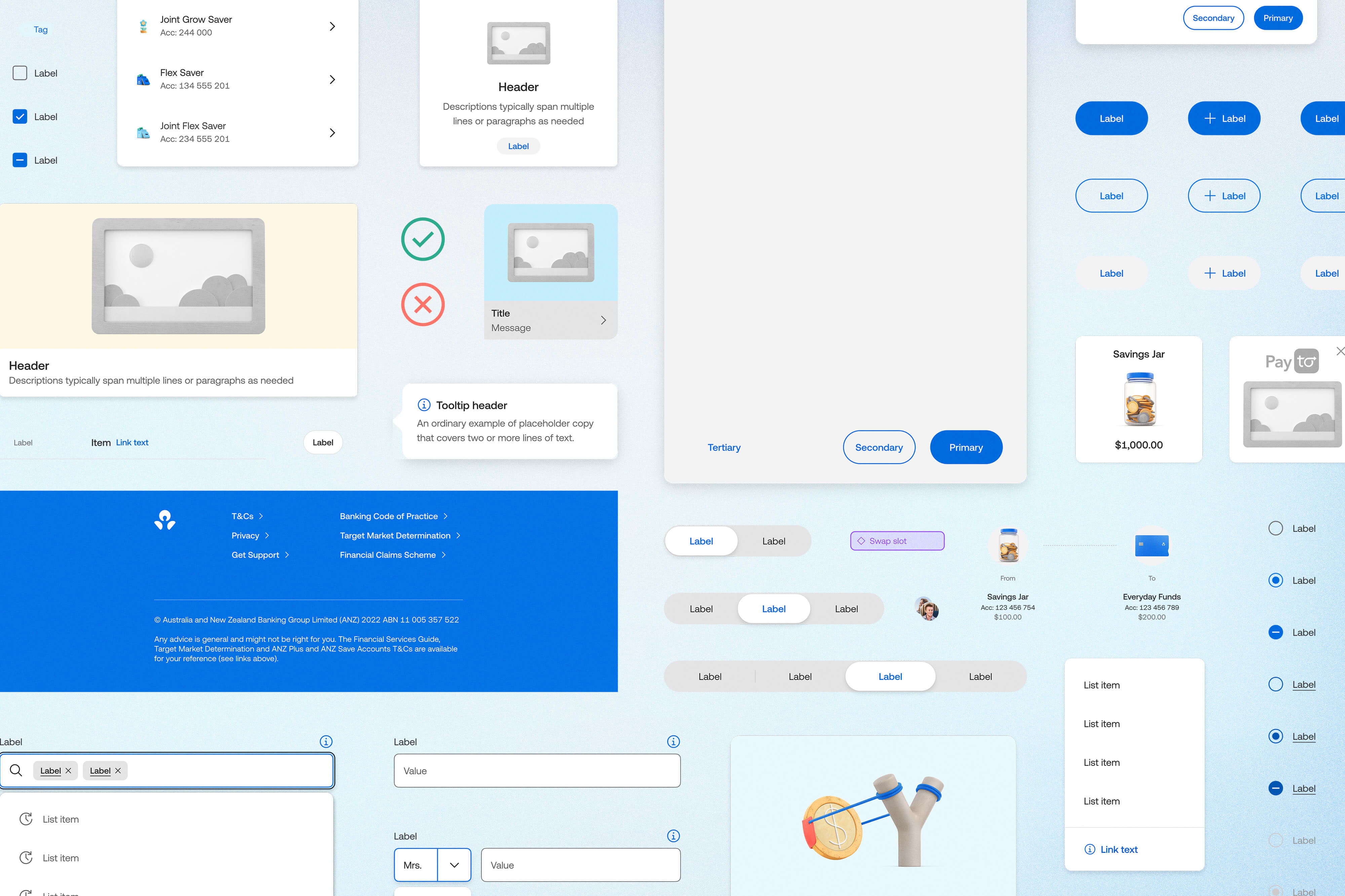
Highlights
- Open Banking feature design for goMoney
- Payments to People flows and prototypes
- Internet Banking uplift and migration work
- New design system patterns applied to older journeys
Some images have been blurred to hide unreleased or sensitive work.
Role
Senior Product Designer
Tools
Figma
Skills
Product Design, Prototyping, User Flows, Information Architecture, UX/UI Design, Content Design
Length
1+ Years
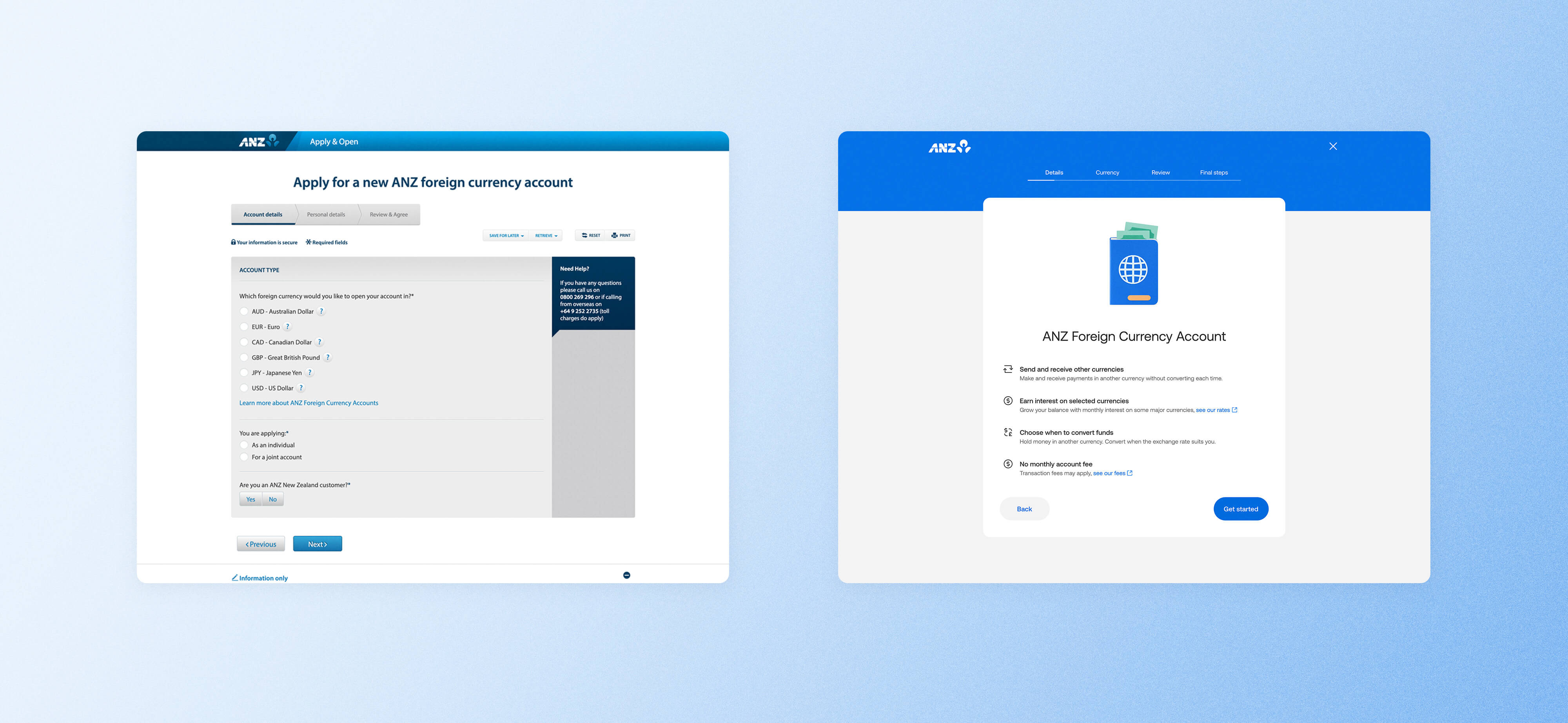
Before and after: updating older application flows with newer ANZ patterns.
I worked with ANZ design teams on projects across goMoney and Internet Banking, helping shape
flows, prototypes, and UI for new features that needed to fit within existing banking patterns.
A lot of this work sat within ANZ New Zealand’s wider transformation work, so it wasn’t just about adding new screens. There were platform changes happening at the same time, shifting requirements, and the usual banking complexity to work through.
A lot of this work sat within ANZ New Zealand’s wider transformation work, so it wasn’t just about adding new screens. There were platform changes happening at the same time, shifting requirements, and the usual banking complexity to work through.
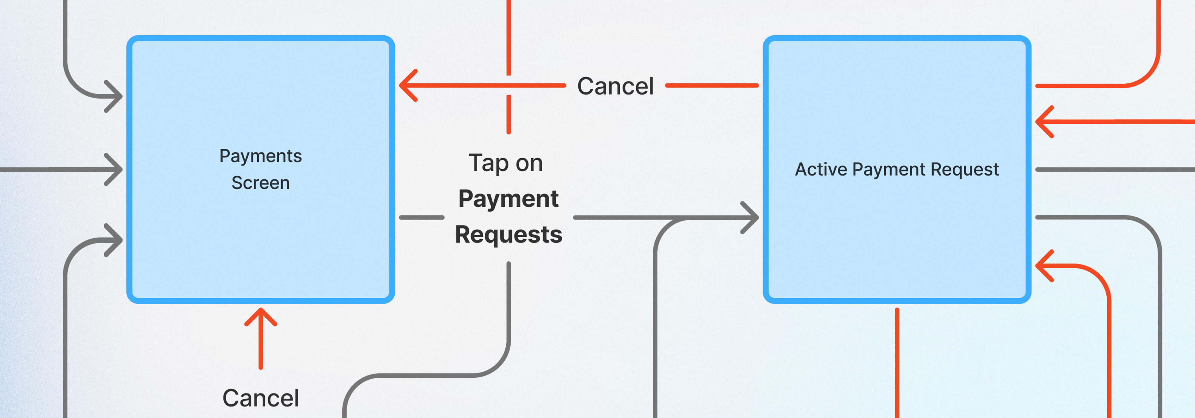
Mapping a proposed Payments to People flow, including edge cases and third-party handoffs.
One stream of work focused on Open Banking in goMoney, including data sharing and Payments to
People. A big part of that was taking abstract feature ideas and turning them into something
people could actually see, click through, and talk about.
I built high-fidelity prototypes to show how third-party payment requests could work, how they could fit within goMoney’s existing payment patterns, and what customers needed to see at each point in the flow.
I built high-fidelity prototypes to show how third-party payment requests could work, how they could fit within goMoney’s existing payment patterns, and what customers needed to see at each point in the flow.
Interactive prototypes used to test flows and gather feedback quickly.
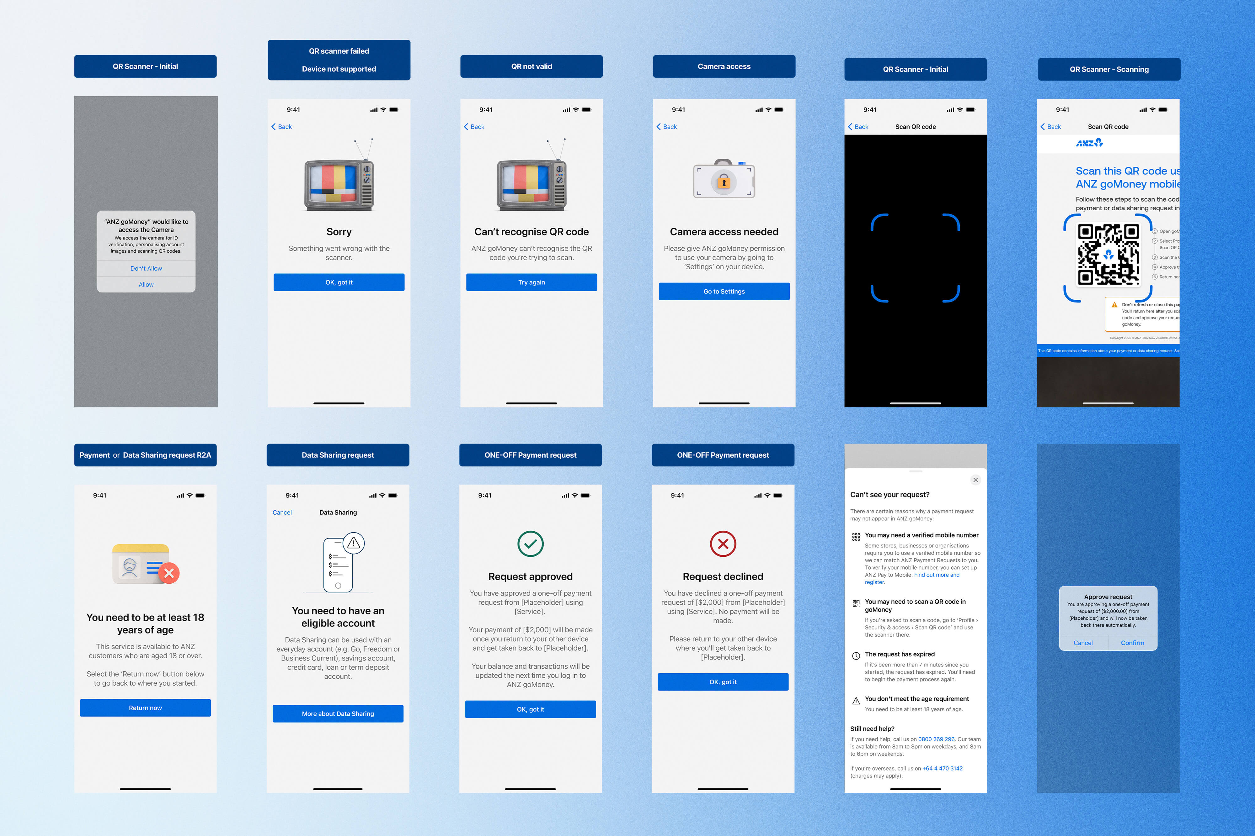
Clarity was a big part of the challenge. Payments to People introduced a flow where ANZ wasn’t
verifying the payee in the usual way, so the UI had to make it clear what came from the third
party, what ANZ was responsible for, and whether a request was one-off or ongoing.
I worked through edge cases, built out full prototype flows, and worked closely with content design so the wording held together across different devices and states.
I worked through edge cases, built out full prototype flows, and worked closely with content design so the wording held together across different devices and states.
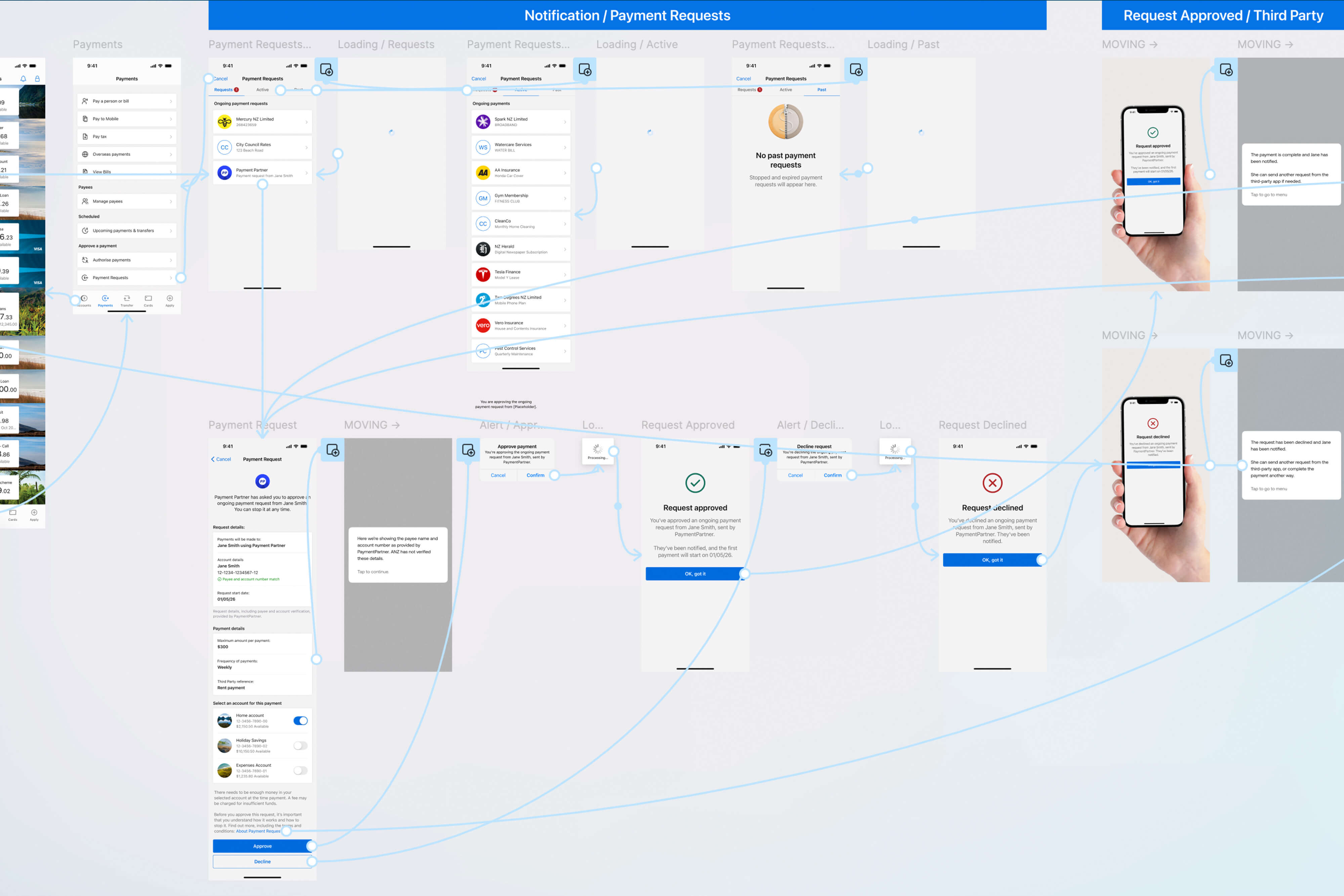
Working through navigation, UI states, and edge cases in the prototype.
Clickable prototypes used to test ideas and tighten the flow.
Another stream of work focused on uplifting older Internet Banking journeys. What started as a
lift-and-shift job quickly turned into something more involved, with changes to layout,
navigation, surfaces, colour, typography, accessibility, and the realities of adapting a new
design direction for New Zealand.
Having worked on the ANZ design system helped a lot here. I already knew the patterns and components pretty well, so I could work through what made sense to reuse, what needed changing, and what had to be rebuilt locally.
Having worked on the ANZ design system helped a lot here. I already knew the patterns and components pretty well, so I could work through what made sense to reuse, what needed changing, and what had to be rebuilt locally.
Translating the Australian design system into New Zealand Internet Banking flows and UI.
Older ANZ screens updated using the adapted design system.
Across both streams of work, I helped make things more tangible and easier to move forward.
Because I’d worked on both the design system and feature side, I had a good feel for how ANZ’s
patterns were built, what was missing, and how they should show up in product work. That helped
keep the work consistent and made decisions easier to land.
Some images have been blurred to hide unreleased or sensitive work.